How To Change Fonts In Squarespace
Part of the fun in editing your website template is changing the fonts. It immediately shifts the tone and feel of the entire design. And there are so many beautiful font pairings to choose from to truly give you that signature branded aesthetic.
In this tutorial, we will go over how to change the fonts, how to upload fonts, and how to customize spacing and sizing of font in Squarespace. By the end, you will know exactly how to edit the fonts in your template to look the way you desire.
Before We Begin
Before changing your fonts, I recommend having your brand fonts handy.
If you already have specific fonts you're using for your brand, have the names available so you can easily search for them inside Squarespace.
If you don't have brand fonts yet, this is also a great opportunity to experiment and find a combination that feels like your business. You can take a peek at our design tips for lovely recommendations!
A little font advice from me: try to keep things simple.
Generally Squarespace allows for two fonts in your website. One primary heading font, and one is your body font. If you wish, you can add a third additional font sparingly if your brand calls for it. It will be placed in miscellaneous.
Step One: Open Your Website
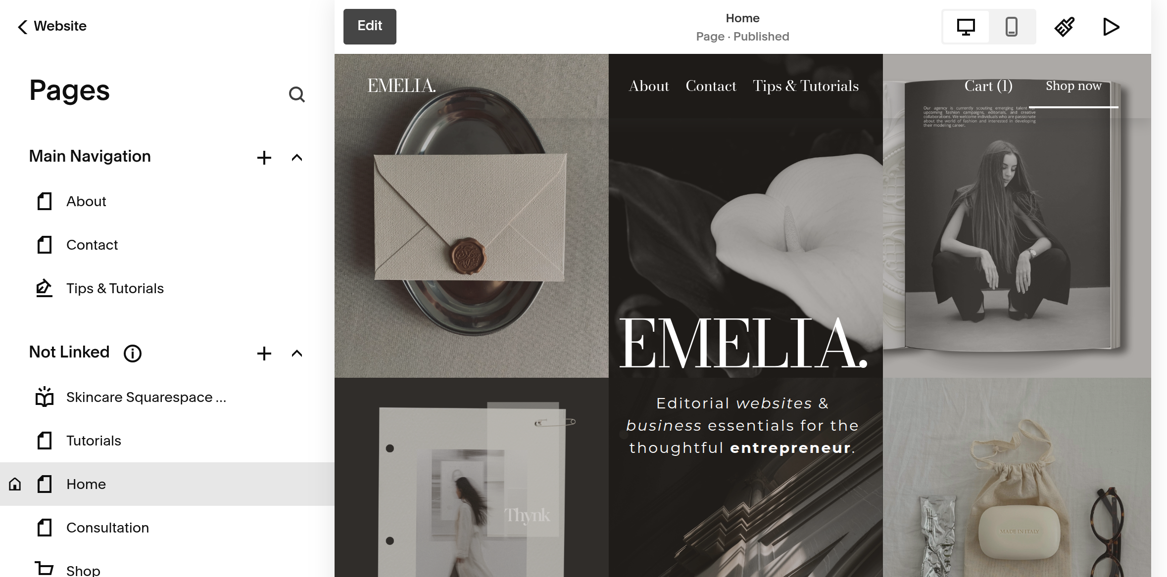
From your Squarespace dashboard, select the website you want to edit.
Once you're inside your website, click: Edit
This will open your website editor.
Step Two: Open Site Style
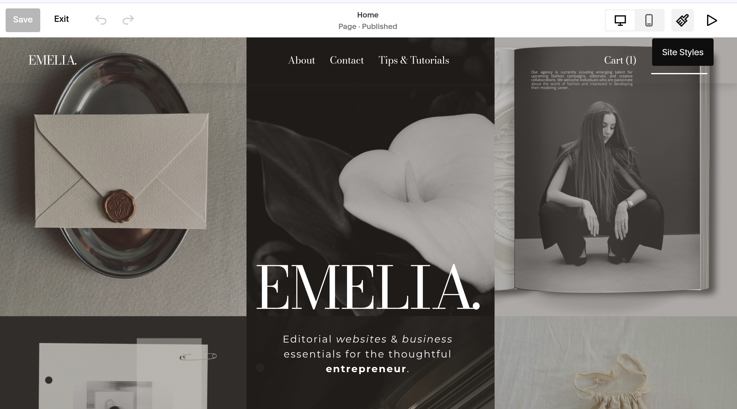
Inside the website editor, look for a paint brush symbol in the top right corner. That is your site style page.
Click this to open your site's overall design settings.
This is where you'll find the controls for your website's fonts, colors, spacing, and other global design settings.
Step Three: Overview Of The Font Panel
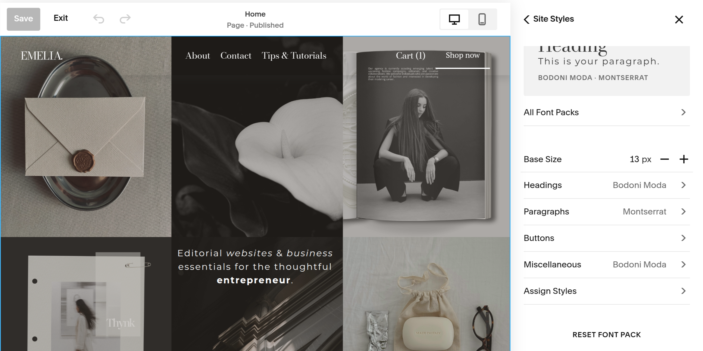
Let’s quickly run through all the options you have before you, so you know exactly how to edit your fonts to match the particular style your heart desires.
BASE SIZE: essential the start point for the sizing of all fonts.
HEADINGS: this is your main font, logo font, headings 1-4. This will drastically change the style of your website.
PARAGRAPHS: this is all the small text throughout the website and occasionally can be assigned to the navigation bar.
BUTTONS: you have three button styles to choose from and in this section you can adjust the font and style to match your aesthetic.
MISCELLANEOUS: some point in the website might not have an assigned font and therefore defaults to the miscellaneous font.
ASSIGN STYLES: this panel is truly important to explore because it gives you the option to change the font styles in every aspect of your website.
RESET FONT PACK: the beauty of making a mistake, is you can easily click this button and it will reset the whole thing.
Step Four: Changing Your Heading Font
Now we're getting into the fun part, your headings.
Your heading settings control the larger pieces of text throughout your website and are one of the biggest contributors to the overall personality of your design.
Inside the Headings panel, you'll see several different settings. Let's go through each one so you know exactly what you're changing and why.
FONT
This is where you choose the actual typeface you'd like to use for your headings.
If you purchased one of my templates, you'll see the font I've selected for the original design. If you love the way the template looks, you can simply leave this as is. If you'd like to use your own brand font, click the font name to open the font library and search for the font you'd like to use.
Your font choice is going to have a huge impact on the personality of your website,h so this is a good place to start when customizing your brand.
Think about the feeling you want your website to create:
Serif fonts → editorial, sophisticated, romantic, classic
Sans serif fonts → modern, clean, minimal, contemporary
Script fonts → feminine, playful, elegant, personal
STYLE
This controls the variation of the font you're using.
You'll see the options Normal and Italic.
Normal
Your standard version of the font.
Italic
A slanted variation of the font that can add a little more personality or emphasis.
My recommendation: don't change this unless you have a specific reason to.
WEIGHT
This controls how thick or thin your font appears. You'll usually see numerical values such as:
300 → Light
400 → Regular
500 → Medium
600 → Semi Bold
700 → Bold
This is an important setting because changing the weight can completely change the feeling of a font.
For example, a delicate serif at a lighter weight can feel very editorial, while the same font at 700 can feel much heavier and more dramatic.
A little tip: if your headings feel too heavy or overwhelming, try lowering the weight before changing the font entirely.
LINE HEIGHT
This controls the amount of vertical space between lines of text. This becomes especially noticeable when a heading wraps onto two or more lines.
For example:
This is a beautiful
website heading.
A smaller line height brings those two lines closer together, while a larger line height creates more space between them.
For large editorial headings, I often prefer a tighter line height because it creates a more intentional, compact look. For body copy, you'll generally want more breathing room.
If your heading looks strangely spread apart or the lines feel like they're crashing into each other, this is the setting to adjust.
LETTER SPACING
This controls the amount of space between individual letters. You can move the slider to increase or decrease the spacing.A positive value spreads the letters farther apart. A negative value brings them closer together.
For example:
T I T L E
has much more letter spacing than:
TITLE
Letter spacing can make a surprisingly big difference, especially with headings.
A little extra spacing can feel:
Airy
Modern
Minimal
Editorial
Tighter spacing can feel:
Bold
Refined
Compact
Dramatic
Be careful not to overdo it. Large amounts of letter spacing can make words difficult to read, particularly when you're using smaller text.
TEXT TRANSFORM
This determines how Squarespace displays the capitalization of your text. You'll have the options:
None
Displays the text exactly as you've typed it.
Uppercase
EVERYTHING APPEARS IN CAPITAL LETTERS.
Lowercase
everything appears in lowercase letters.
This is particularly useful when you want a consistent look without having to manually type every heading in uppercase.
For example, you could type:
About Me
and use the uppercase text transform to display it as:
ABOUT ME
This is especially handy for navigation, labels, buttons and smaller editorial-style headings.
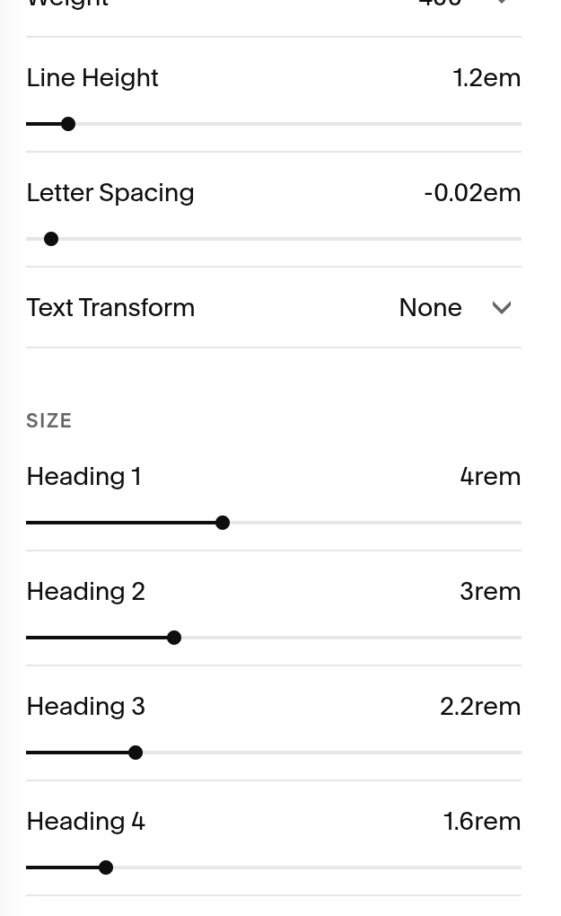
SIZE
You might be wondering why you can't just have one heading font and one size. You absolutely can keep things simple, but having multiple heading styles gives your website a clear visual hierarchy while also signalling to search engines what is most important..
Think of your website like an outline:
Heading 1
The main idea.
Heading 2
The major sections.
Heading 3
The smaller sections within those sections.
Heading 4
The smaller details.
This helps your visitors and search engines naturally understand what information is most important as they move through your website.
It also keeps your website from feeling like one giant wall of text. I would suggest having your Heading 1 being the largest in size and Heading 4 to be the smallest.
Step Five: Changing Your Paragraph Font
Best news ever! It is exactly that same process as your heading except with a font that is simple and easy to read. This is where san serif fonts truly take center stage. You want the spacing to be relatively normal and the size big enough that people can read on all types of screens.
Step Six: Button Fonts
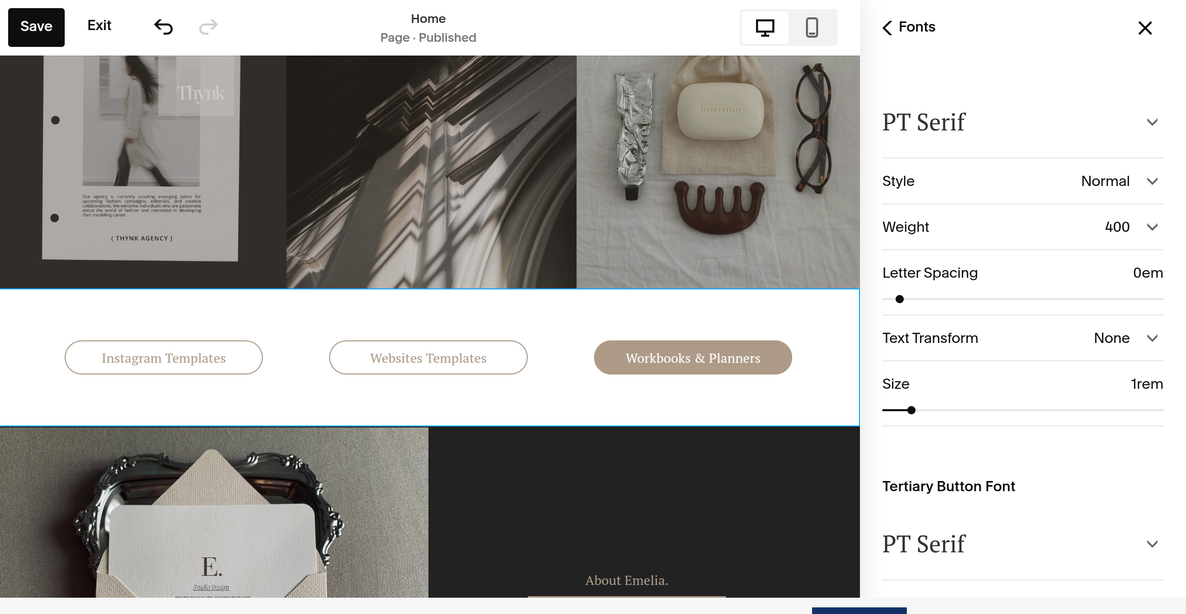
This is where you can have a little more fun with your typography. Your buttons are a smaller element of your website, so this can be a great place to introduce a little more personality—or even bring in a third font that isn't used anywhere else on your site.
Above each button type, you can select the font you desire. I tend to keep each the same for consistency, but do what looks best for your brand.
The rest follows exactly like the heading and paragraph, which I am sure you are pro at by now!
A fun design tip, buttons are where letter spacing can be fun to play with and UPPERCASE as well. I love add a bit more space and uppercase to make it more exaggerated.
Step Seven: Miscellaneous Font Setting
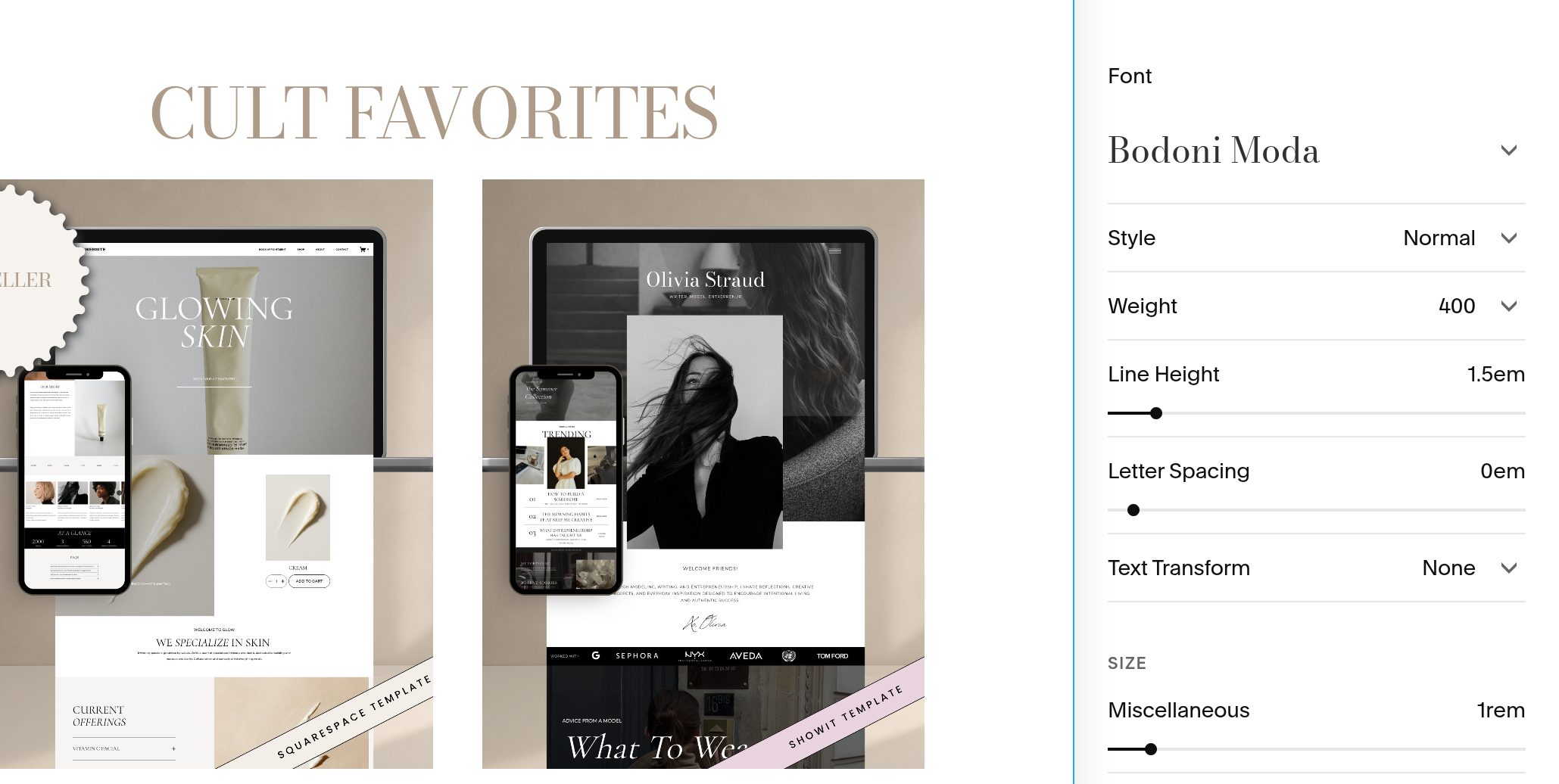
The Miscellaneous font controls text that doesn't fall under your headings, paragraphs, or buttons. Which includes blog post dates, categories, tags, author names, pagination links, and other smaller site features.
There is also a fun little trick here: Squarespace connects the Miscellaneous font to the Monospace text format. This means you can use your Miscellaneous font as a third, accent font throughout your website.
For example, choose a script, display, or bold serif font under Miscellaneous. Then, inside any text block, highlight the text you want to change and select Monospace from the text formatting options. That text will automatically take on your Miscellaneous font.
Step Eight: Assign Style
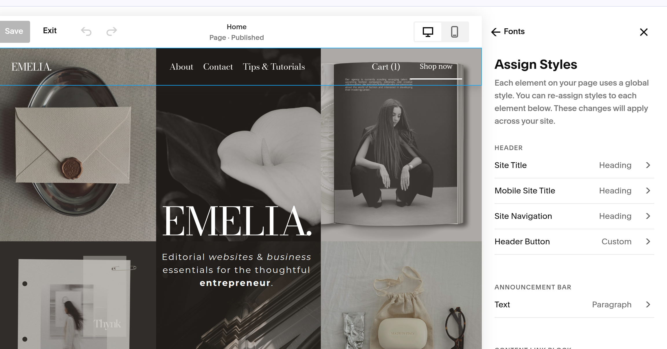
This section overtime, will become one of your favorite tool. You ultimately get to decide which font style is assigned to different areas of your website and make adjustments when something doesn't look quite right.
For example, maybe you love your main heading font, but there's one particular heading on your website that feels too large or doesn't quite fit the section. Instead of changing your entire heading style, you can use assign styles to adjust which style that particular text is using.
This gives you much more control without having to completely redesign your typography.
And that's it! You've officially made your way through the Squarespace font panel and should now have a much better understanding of how all of those settings work together.
Remember, you don't need to change every setting just for the sake of changing it. If you love the typography already in your template, keep it! If you're customizing the design to match your own brand, start with your heading and paragraph fonts, then work your way through the smaller details until everything feels like you.
