How To Customize Your Color Palette In Squarespace
Did you buy a template and immediately imagine what it might look like with a completely different colorway? Or perhaps you are an establish brand and need to adjust the palette to match your current branding.
Either way in this tutorial, we will go through how to customize your color palette in Squarespace, what each box represents, how to adust the transparency, and how to adjust the colors assigned in the theme pallets.
Before We Begin: Understanding The Color Palette

When you open ”Edit Palette”, you'll see five different color slots. These colors work together to create the overall palette for your website, with each one having a slightly different role.
Lightest — Slot 1
Usually white or an off-white tint, this is your primary light background color.
Light Accent — Slot 2
This is your secondary soft tone. It's a little more noticeable than your lightest color and can be used to create subtle contrast between sections without making the design feel too busy.
For example, if your primary background is a warm white, your Light Accent might be a soft beige, blush, pale blue, or another muted version of your brand color.
Accent — Slot 3
This is your main brand highlight. Squarespace commonly uses this color for things like call-to-action buttons, links, and other elements that need a little extra attention. This is a great place to use one of your more recognizable brand colors.
Dark Accent — Slot 4
This is your supporting medium or dark tone. It can be used for secondary text, darker backgrounds, or alternate section blocks. Think of this as the color that helps bridge the gap between your lighter palette and your darkest color.
Darkest — Slot 5
Usually black or a near-black shade, this is your highest-contrast color. It's often used for body text, headings, dark section backgrounds, or your footer. It doesn't necessarily have to be pure black, either. A deep brown, charcoal, navy, or another dark brand color can work beautifully here.
Step One: Editing Your Color Palette
HEX Code
If you already have your brand colors picked out, using a HEX code is probably going to be your best friend.
A HEX code is a six-character code that tells Squarespace exactly which color you want to use.
For example:
#F4EDE4
If you have a brand style guide, Canva brand kit, logo, or another place where you've already chosen your colors, you may already have these codes available.
Simply enter the HEX code into the color field and Squarespace will apply that exact color.
This is the easiest way to make sure your colors are consistent throughout your entire website.
Color Picker
You can also choose a color visually using Squarespace's color picker. This allows you to move around the color field and select a shade that feels right.
This is a great option if you're still experimenting with your palette and don't have specific brand colors picked out yet.
You can adjust the color until you find something that feels like you.
From An Image
Squarespace may also allow you to pull a color directly from an image.
This can be especially helpful if you have a photograph, mood board, or other image that already captures the overall feeling you want your website to have.
For example, maybe you have a photograph with beautiful warm browns, creams, and muted greens. You can use that image as inspiration and pull one of those colors directly into your palette.
This can be a really easy way to create a color palette that feels naturally cohesive because the colors are already existing together within the image.
From Presets
Squarespace also provides a plethora of color palette presets that are a great place to quickly test out different colorways and understand what really resonates with you.
I always suggest writing down the original HEX values from the template you purchase. That way you can always manually reset the color palette back to the original if all else fails!
Step Two: Editing Color Themes
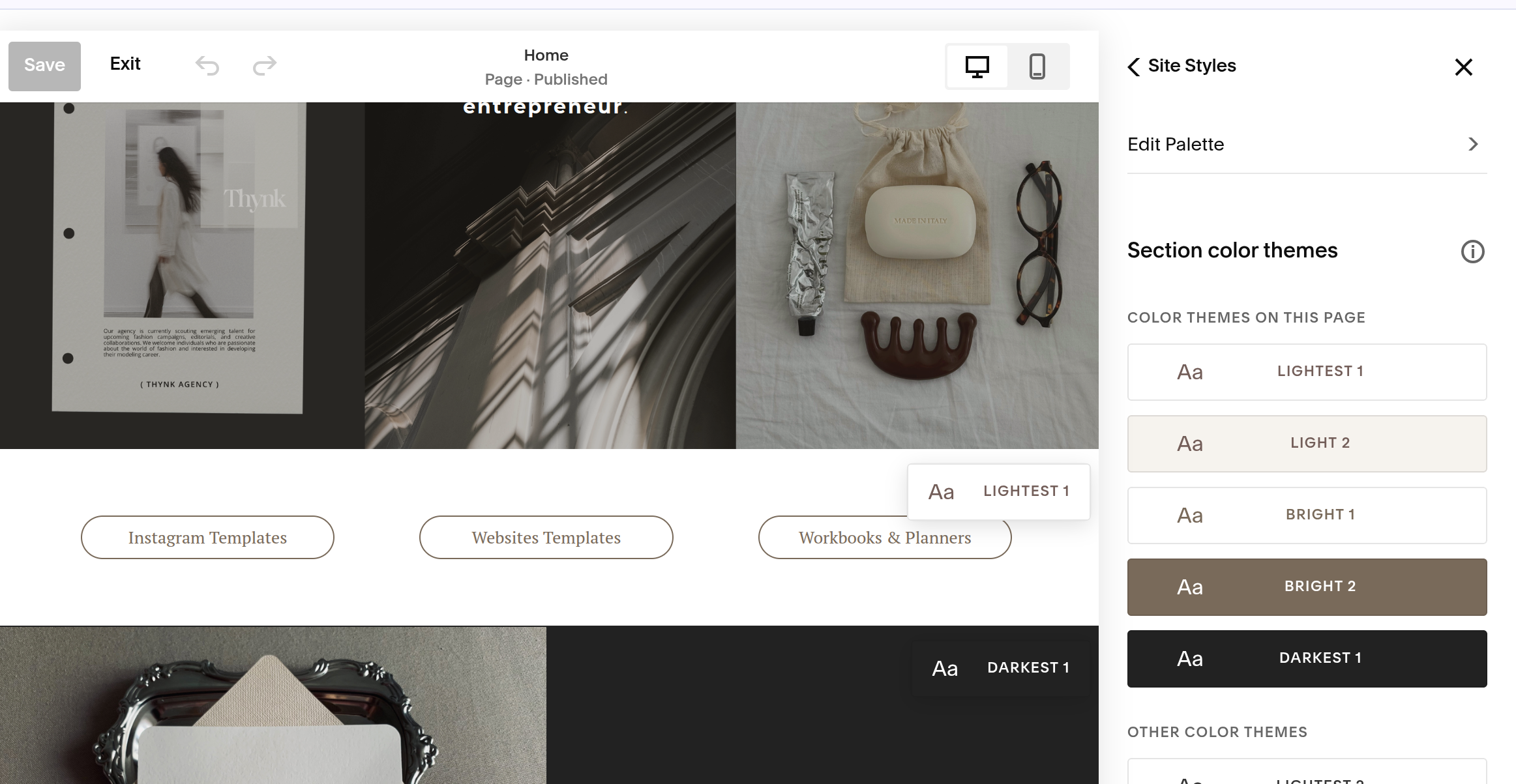
Each section, or block, of your website can be assigned one of these Color Themes. This is a great way to create distinct segments throughout your webpage, highlight certain sections, add contrast, or even introduce a little more moodiness to your design.
For example, you might use your lightest theme for most of your website, switch to a darker theme for a services or testimonial section, and then use your accent theme for a call-to-action.
It gives you the ability to create visual variety throughout your website while still keeping everything within your overall brand palette.
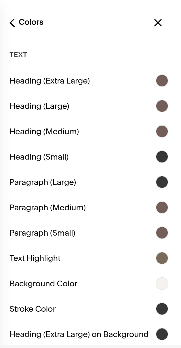
Just like your fonts, this is where you can make adjustments if something on your website doesn't look quite right.
Maybe you've changed your brand colors and suddenly the text on one section is difficult to read. Or perhaps a button doesn't have enough contrast against its background. This is where you can go in and adjust the color theme to make sure everything is working properly.
The beauty of Squarespace is that it makes it much easier to see which color theme is being used.
When you're editing a section, Squarespace will highlight the Color Theme that is currently being used. This makes it much easier to identify which theme you need to adjust instead of having to guess your way through every color palette.
So, if you come across a section where the text isn't showing up the way you'd like, simply:
Find the section that needs adjusting.
Identify the Color Theme it's currently using (should be highlighted to the left)
Adjust the colors within that theme until everything is easy to see and feels right.
Return to your website and check the section again.
You can adjust the background, text, accent, button, or any of the other colors within that particular theme until you get the look you're going for.
The goal isn't necessarily to change every theme. If everything is looking good, leave it alone! But if something feels a little off, this is the first place I'd recommend checking.
And just like that you have completely customized your color palette in Squarespace!
